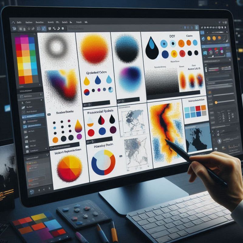
Color contrast is one of the most powerful visual techniques in character design. By using clear differences between light and dark colors or contrasting colors, illustrators can create depth and focus in their work. This article explores how color contrast can be used to emphasize characters, convey specific impressions, and make characters stand out in illustrations.
1. What Is Color Contrast?
Color contrast refers to the noticeable difference between two colors used in design. Colors that are directly opposite each other on the color wheel, such as blue and orange or red and green, create strong contrast. Contrast can occur in various forms:
- Light and dark contrast (e.g., using bright colors on specific parts of a character to attract attention)
- Complementary color contrast (using colors that are opposite on the color wheel, like red and green)
- Warm and cool color contrast (e.g., combining warm colors like red with cool colors like blue)
2. Using Contrast to Highlight Character Personality
Every character has certain traits or roles within a story. The choice of color contrast can support the portrayal of a character’s nature or emotions.
- Strong and Bold Characters: Sharp contrasts like red and black can emphasize strength and boldness.
- Soft and Calm Characters: Softer contrasts, such as light blue and pale green, can emphasize calmness and gentleness.
- Mysterious or Antagonistic Characters: Darker colors and higher contrast, like dark purple with neon green, can give a mysterious or even sinister aura.
3. Using Contrast to Guide the Viewer’s Eye
In addition to emphasizing characters, contrast can also be used to guide the viewer’s eye to specific areas of the illustration.
- Main Focus: In illustrations, the parts of the character you want to make clear or give more attention can be given bright or high-contrast colors, while less important background elements or details can use more neutral tones.
- Symmetry and Asymmetry: Using asymmetric contrasts (for example, a brighter face with a darker body) can draw attention to important areas, like the character’s expression.
4. Principles of Color Contrast in Design Context
- Color Balance: While color contrast can be very striking, too much high contrast in an illustration can make the character feel unbalanced. Therefore, it’s important to balance contrast with the use of neutral colors to allow the main elements to breathe.
- Proportions Matter: Using contrast in only certain areas of an illustration can create a dynamic effect without making the entire character feel too overwhelming.
5. Case Studies: Using Color Contrast on Popular Characters
To provide a clearer picture, let’s look at some iconic characters from various media who effectively use color contrast:
- Superhero Characters like Spider-Man or Iron Man, who use bright and contrasting colors (red, blue, gold) to emphasize their strength and identity.
- Villain Characters like the Joker or Darth Vader, who utilize dark and light contrast to create a menacing and powerful presence.
6. Conclusion
Color contrast is a powerful design tool to emphasize characters in illustrations. With the right choice of colors, contrast can enhance the visual message of a character and deepen the emotional impact it leaves on the viewer. As illustrators, understanding how to wisely utilize color contrast will elevate the quality of work and make characters more vibrant and memorable.
This article will help illustrators understand and apply color contrast in their character design, creating more dynamic and meaningful visuals.
